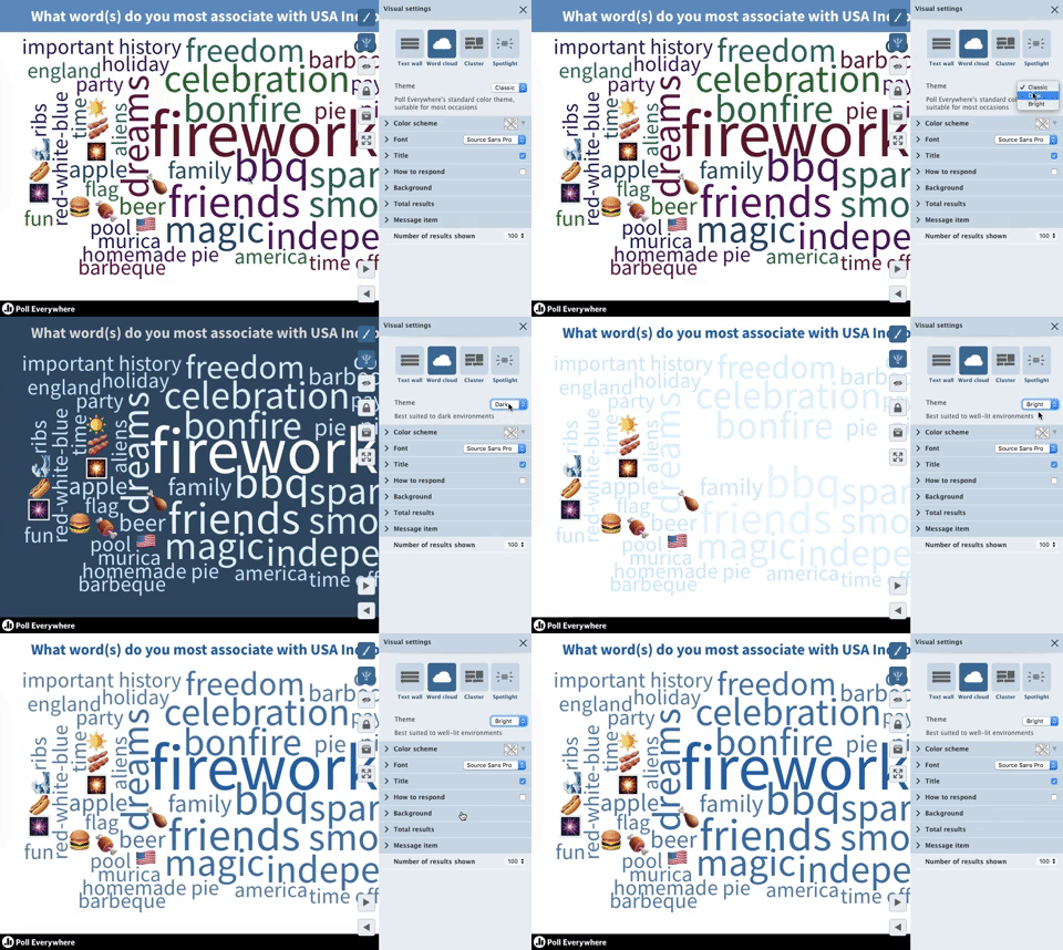
Choose the perfect colors for your venue with light and dark themes

Nearly every aspect of a Poll Everywhere activity can be recolored to match your presentation’s unique style. The text, response chart, even the audience response screen – all can be adjusted to colors you choose.
Now, you can also use visualization themes to stylize activities with a single click.
Together, these themes let you quickly adapt to the lighting conditions of your presentation venue. The Bright and Dark themes were intentionally designed to improve readability in well-lit and under-let environments, respectively.
This update is available now for all Poll Everywhere presenters. Read on to see them in action, and get instructions on how to access themes on your account.

Default visualization theme
Locate these themes by visiting My Polls and selecting the activity you wish to customize. On the following screen, look for the paintbrush icon to the right of your activity. Select the paintbrush to open the visual settings menu. The ‘Theme’ menu is at the top.
Appropriately enough, the Classic theme is selected by default. Classic is the color scheme Poll Everywhere veterans are familiar with, complete with creamy white and Poll Everywhere blue tones. These muted colors are a good fit for most default presentation color schemes (as well as a clear indicator that this is a Poll Everywhere activity slide).

Bright visualization theme
Bright is best suited for well-lit venues, or even outdoors. The sharp blue chart and clean white background make your activity stand out against washed-out presentation screens. If you’ve ever had to squint to make out what’s on a presentation screen because every light in the room is on, this is the theme you want.

Dark visualization theme
Dark is best suited for low-light presentation venus, or total darkness. If your presentation screen is the only source of light in the venue, the last thing you want to do is blind the audience with bright colors. The darker tones of Poll Everywhere blue are easier on the eyes in these situations.

Of course, all of these themes can be adjusted however you like. Think of them as a starting point to a near-endless array of customization options. At any time you can return to the default Classic, Bright, or Dark themes by re-selecting them in the visual settings menu.
This update joins branded response page, donut charts, and the word cloud update as the latest way for presenters to better control the look and feel of their Poll Everywhere activities.
Sample Call To Action Button